
Fountainvoid
》Starting from Ogham
The idea started out with Ogham - animating Ogham as the symbols follow curves, and to use that for displaying informaiton on-screen.
In case you don’t know, Ogham is an alphabet that started out to write early Irish. Here is "nundrum" using the alphabet so you can see how it looks:

That is a striking look, but would be utterly indecepherable! I don’t want to refer to a code chart just to read the screen.
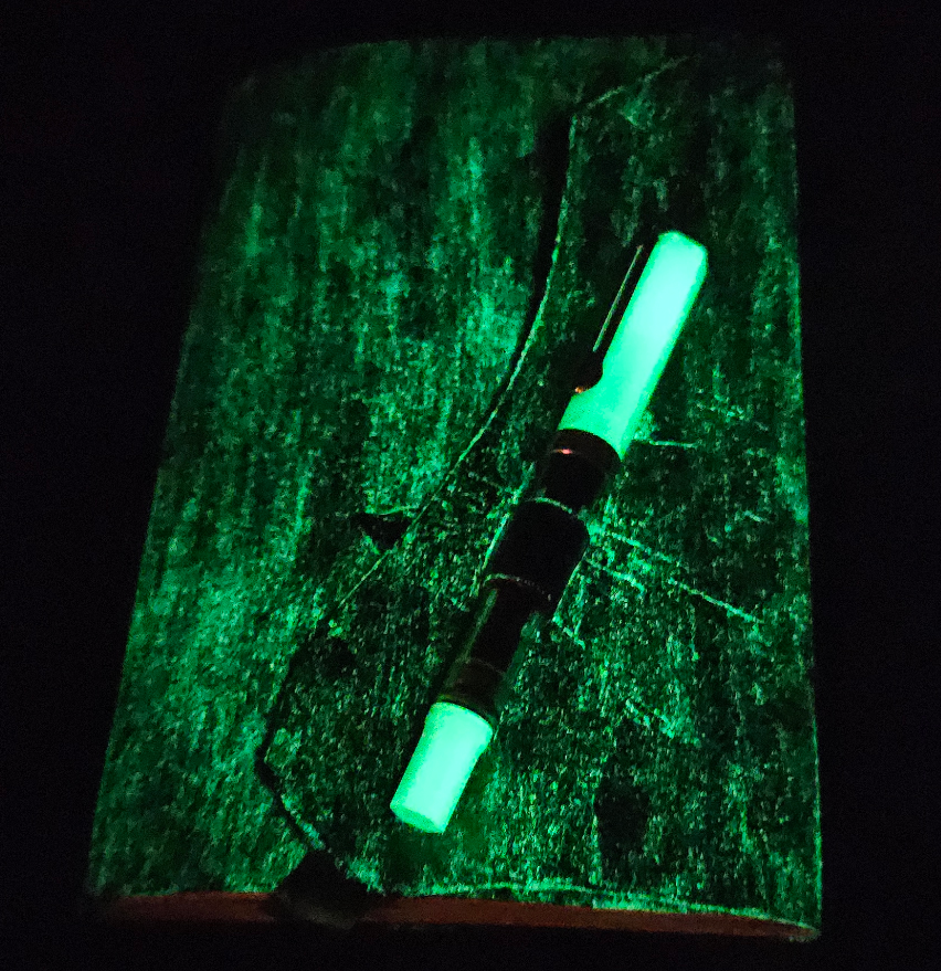
So I started playing around with writing the Latin alphabet connected by a baseline. That was also a great reason to break out the new fountian pen and bottle of ink. Yes, I have a glowing fountain pen and journal.
》The Bones
First up was the baseline itself, and I liked the way Ogham lines begin and end
with those angled >/< marks. But I also felt the font would have to be more
"curvy" if it was to accomodate the usual letters. A little doodling also made
me realize that fewer pen-lifts and backtracks would be better for the
handwritten version.
Those doodles led me to use these two-ended stuctures as the base period, exclamation mark, and question mark. Letters would be drawn on the line in between:

Here are some early versions of a through z made into SVG based on my
doodles:

Not bad … but also not good. The written version is even worse. Letters like
c and s are unbalanced in size. Many of the others are unreadable, like q.
But o and m, n and uvw were good and fit the kind of style I was going for.
This first alphabet helped set the feel for the font: many similar curves, some extending the midline, some deviating from it, and many mirrored parts.
》The Problem Letters
Some letters were a much bigger problem than others.
》C
The most obvious problem was c. Writing it required covering both the ascending
and descending parts twice. And overall it was just ugly. At some point I realized
the c could be written as paritally as the a, which itself remains only as the
cap. So mirroing the a around gave me this:

Flipping the a upside-down also gave me a good j.
》BDPQ
These were the most obvious problem letters. If you really squint, they appear
to be a stemless version of their normal counterparts. But they’re hard to read
and even worse they’re unpleasant to write. Though q started out as a
hook-shape, that didn’t work well and was very difficult to distinqush. So it
got swapped into this.

I tried opening the part of the letters that touched the baseline, which was a little better, but just didn’t look good. Adding the stems back made the letters more legible, but looked like normal letters in strikethrough. Finally I settled on this:

》FH
h
Imagine I wrote that with an icy hiss.
This was the most difficult letter to desgin. Just look a this. Ick. Is it
a cardiogram readout? A really ugly m?

Other approaches were also a problem. Adding a stem made it hard to read and
hard to write. Using a capital-H style pair of vertical lines looked like a
double l.
It was in the design of the f that a solution was found. The original f
looked too like an s. Writing it cursive-style looked very out of place.
Then I thought: why not borrow from the floating-bar t that I had figured
out earlier? Just make it a pair of floating bars and it is very suggestive
of an f.
Letter h still took me some play to come up with. The result is by far the
most abstract in the font. But it provided a nice counterpoint to t and f.
Adding a tiny tick on the line allows for easier alignment of the bars when
writing by hand.
Here is the final version of f and h:

》26 And Me
After spending an hour or two over a few evenings I had mostly settled on the final design. I don’t know where the name came from, but "fountainvoid" popped into my head and it seems to fit. That name also shows off the font nicely:
》hamburgevons
Along the way I learned that the nonsense word "hamburgevons" is used for
showing off fonts as it contains all the elements used to make up the Latin
alphabet. And in this case it shows off the unusual h.


》Font Design and Font Design Issues
I installed FontForge to make the font. There was quite a bit
to learn, but the documentation for it covered everything fairly well. I wish there
had been some better guides and perhaps videos on using the bezier tool. Though it
looks a lot like Inkscape’s it does not behave the same way. I had to fumble into
figuring out some things like shift-drag will constrain the movement of a node but
only after the dragging has started.
The spiro tool is not one I used for this project. There were some videos that cover how it works, but this font just didn’t need it. The geometric feel of the letters worked fine with bezier curves.
》Kerning
Kerning is just tedious. In some cases what looked right in FontForge had tiny gaps when imported to KDE as an OpenType font. So that involved annoying iterations since there is no KDE mechanism to update a font in place (that I could find, anyway).
There is also a lot to learn about kerning pairs which the documentation covers just enough that I could make it work, but not enough to really understand what is happening.
》Questiondown, Exclamdown, but no Perioddown?
Remember this from above? Period, exclamation point, question mark.
Having a leading and trailing curve is great for the look of the font, but does not
map well to the characters we use every day on a computer. The end-curve of exclamation
point line is the standard ! character. The end-curve of the question mark is
of course just ?. Luckily other languages use ¡ and ¿ which I could encode
the start-curves as. In FontForge these are called exclamdown and questiondown.
It seems these are the names taken from PostScript.
But the period line? The end is . of course, but there’s not a perioddown
to match it for the start. After digging through possibilites in Unicode I settled
on DOT ABOVE or ˙ which can be encoded in
HTML as &DiacriticalDot;. And for Vim fans, it’s digraph '. which is handy.
》And Then There Were Ten
Getting all of the above done had taken me five days of off-and-on work, maybe less. In truth it wasn’t very hard at all. And with that thought I had jinxed myself.
Fountainvoid was lacking numbers. I realized that would be a big problem if I was to incorporate it into other projects. Designing ten numbers took double the time of desgining twenty-six letters! Our standard Arabic numerals simply did not lend themselves to the style of the font. I tried many of the same approaches used in the letters - only use half the stroke, or leave void areas, or use illusory contours - nothing worked! Most attempts also caused ambiguation problems with the existing letters.
Other ideas that didn’t work:
Regular or modified Cistercian numerals
Abstract lines, dots, triangles, circles
Roman numerals
†Taking numbers off the baseline entirely
So the numbers deviate much more from their everyday counterparts than the letters do.
Each number had to be evolved out on it’s own. One was simple. Three was a
breakthrough - it was turned on an angle and slightly raised to create a
crescent shaped void. Five was stolen from Roman † and seven inspired by
that. Nine was hardest, but in the end looks like a normal 9 but with
a sort of tail.
Here are the numbers, surrounded by parenthesis:

If you take a look below, you can see where the numbers are "hidden" in the line:

》Fountainvoid
If you are interested in it, I will put the font files on Github at some point in the near future. There are a few characters to round out and some kerning errors to fix.